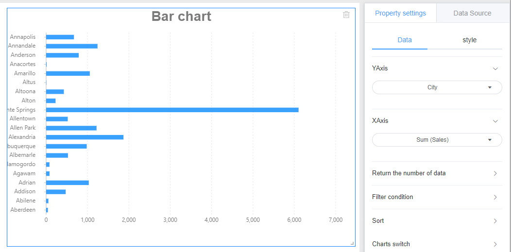
Bar chart
The bar chart is the rotation of the histogram. It is mainly used to compare the numerical values between the categories using horizontal columns when the classification is too much, which is good for reading. The Y axis represents the classification dimension to be compared, and the X axis represents the corresponding value.
1. Create
Click on Charts -> Bar Chart to draw a bar chart on the canvas.
2. Data settings
Referring line chart data provided
3. Style settings
The bar chart style is divided into three parts: background, title, and drawing area.
Referring specifically set line graph style setting the corresponding module.
4. Location and size
Referring line chart setting position and size