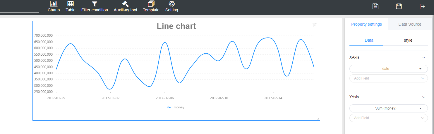
line chart
A line chart is used to show the change of data over a continuous time interval or time span. It is characterized by a tendency to reflect things as they change over time or ordered categories.
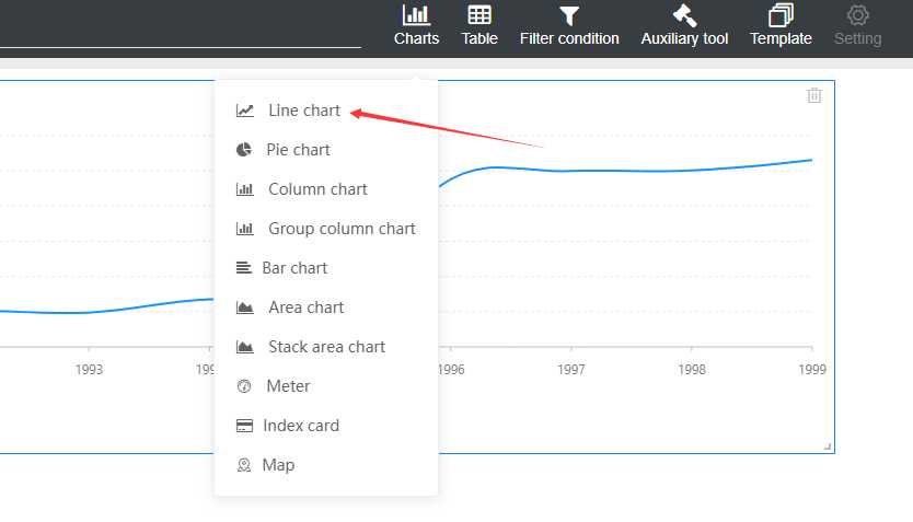
1. Create
Click on Charts-> Line Chart to draw a line chart on the canvas.
2. Data settings
1. Click to select the chart on the canvas, pop up the property panel on the right, and select Properties Settings -> Data.
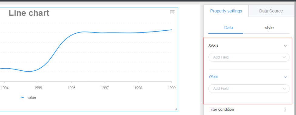
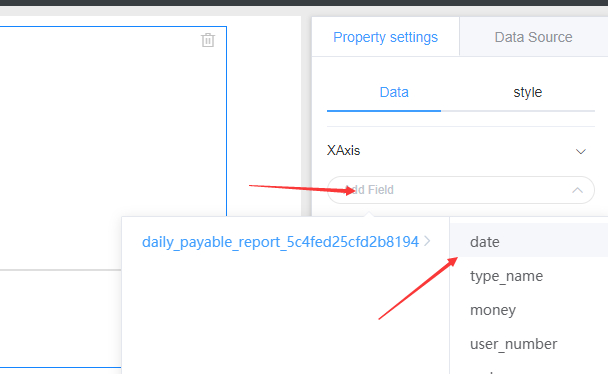
2..X axis setting
Click the X-Axis Add Field drop-down menu to select the table and field
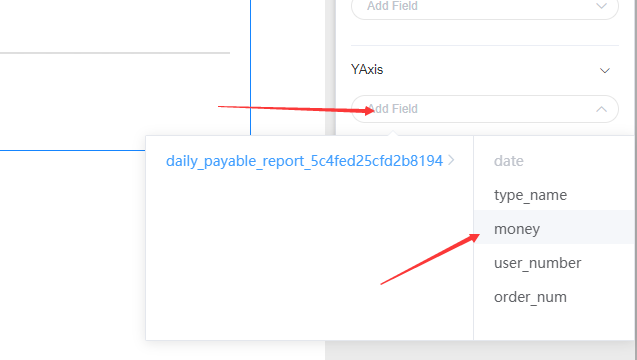
3.Y axis setting
Click the Y-Axis Add Field drop-down menu to select the table and field
The data setup is complete and a line chart is created successfully.
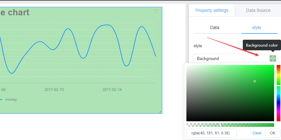
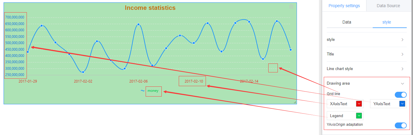
3. Style settings
Select Attribute Settings -> Style, the style is divided into: background, title, line drawing style, drawing area four areas, respectively corresponding to different areas of the chart, modify the relevant parameters to set the chart style.
1. Background setting
Click the icon on the right side of the background bar to bring up the color dial and select the appropriate color according to your needs.
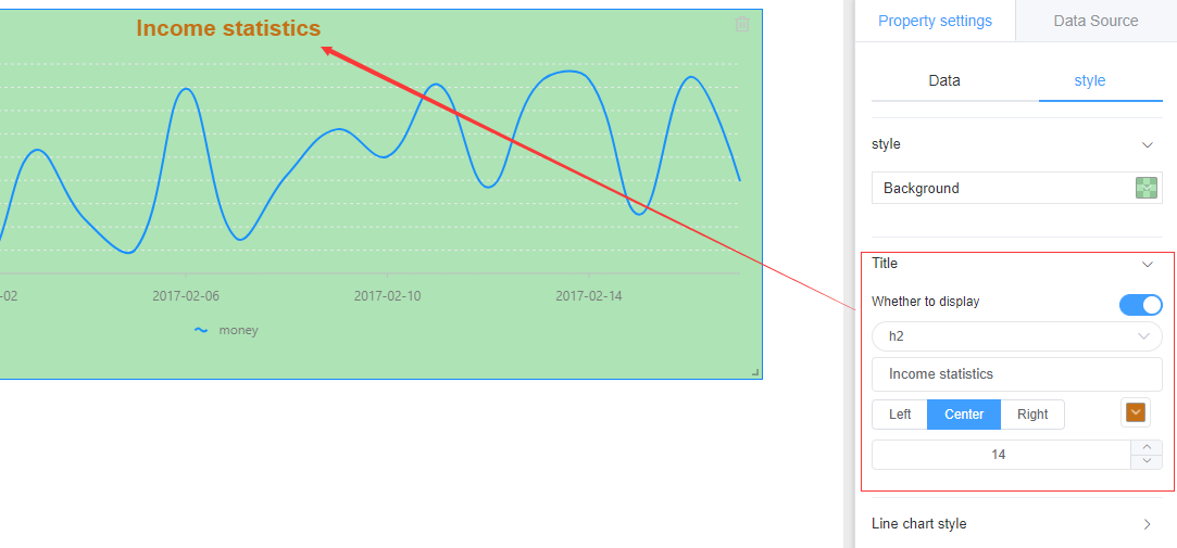
2.Title setting
You can set whether to display the title, display the title's name, location, color, font size, etc.
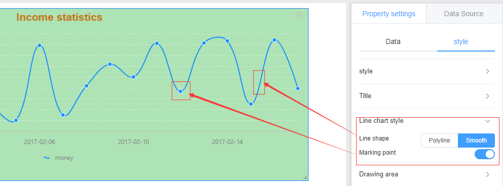
3. Polyline style
Line and marker points for polylines can be set
4. Drawing area
Configure the chart text color to make your chart stand out.
4. Location and size
1.Position
Left mouse click to select the chart is not loose, drag to change the chart position.
2.Size
Move the mouse to the lower right corner of the chart and drag to change the size of the chart when the mouse changes to a double-headed arrow.