Pie chart
The pie chart is used to represent the proportion of different categories, and the various categories are compared by the magnitude of the arc. The pie chart divides a round cake into a plurality of blocks according to the proportion of the classification. The whole round cake represents the total amount of data, and each block (arc) represents the proportion of the classification to the total size, and all the blocks (arcs) The sum of ) is equal to 100%. It can help users to quickly understand the proportion of data distribution.
1. Create
Click on Charts -> Pie Chart to draw a pie chart on the canvas.
2. Data settings
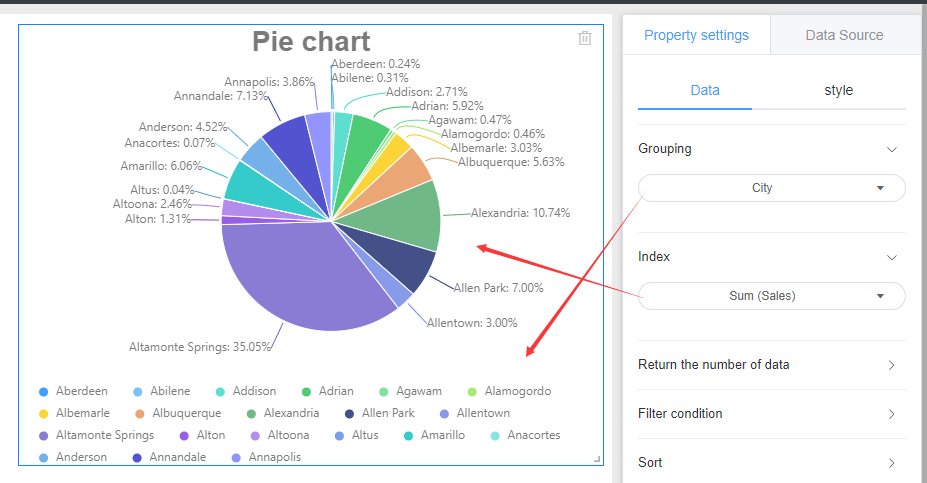
The pie chart involves two parameters: grouping and indexing. The grouping is used to divide the pie chart pie block. The indicator is the specific value of each block, and the pie chart shows the size of each block.
3. Style settings
The pie chart style is divided into three parts: background, title, and drawing area.
Referring specifically set line graph style setting the corresponding module.
4. Location and size
Referring line chart setting position and size