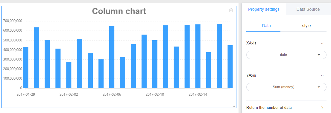
Histogram
A histogram that uses vertical bars to show numerical comparisons between categories. The X axis represents the classification dimension that needs to be compared, and the Y axis represents the corresponding value.
1. Create
Click on Charts -> Column chart and draw a histogram on the canvas.
2. Data settings
Referring line chart data provided
3. Style settings
The histogram style is divided into three parts: background, title, and drawing area.
Referring specifically set line graph style setting the corresponding module.
4. Location and size
Referring line chart setting position and size