map
A statistical map is a map that uses visual symbols (usually colors, shadows, or different dense halos) to represent the distribution of a range of values on a map partition. In several small zoning units (administrative zoning or other zoning units) in the entire drawing area, grading according to the number (relative) indicators of each zoning, and using the corresponding color level or different dense halo lines to reflect the concentration of each area phenomenon Differences in the distribution of degrees or levels of development, most commonly in the visualization of election and census data, are based on provincial and municipal geographic regions.
1. Create
Click on Chart -> Map to draw a map on the canvas.
2. Data settings
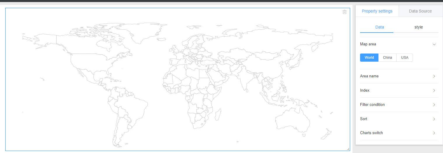
1、map area selection
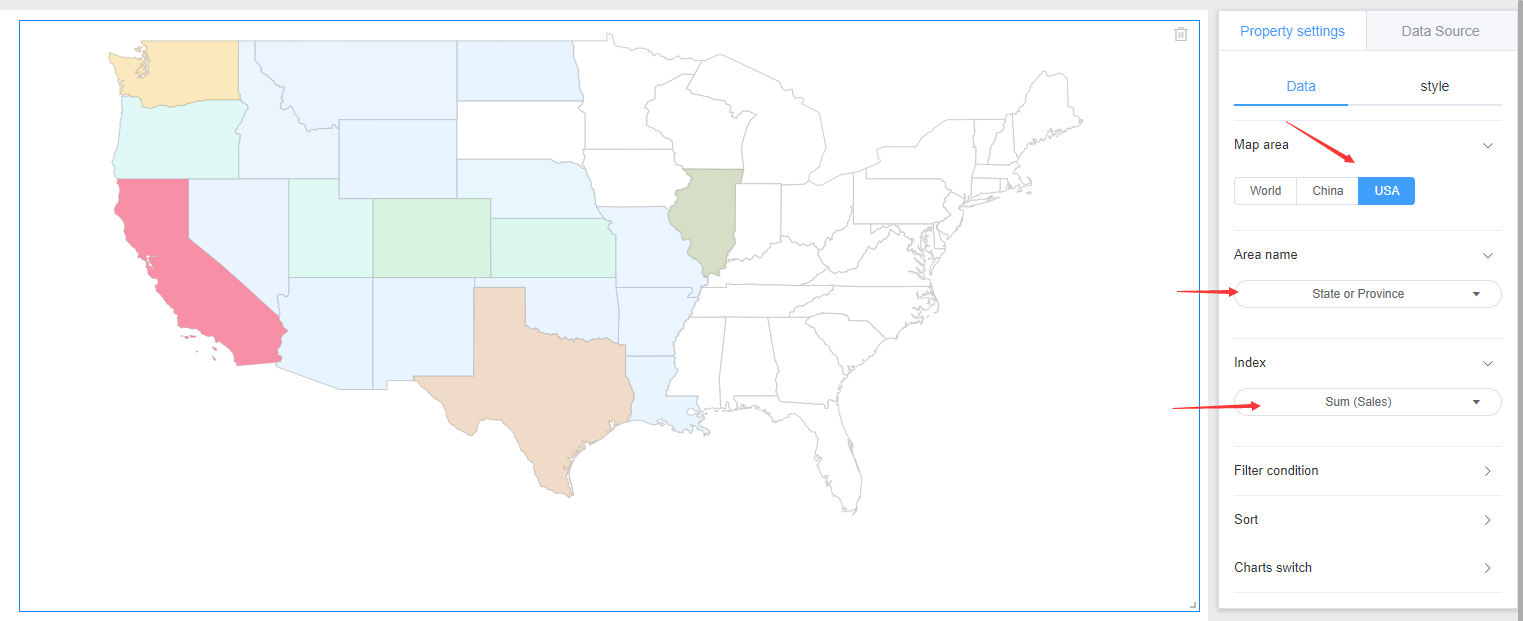
Three map options are available for World, China, and USA. You can select the corresponding map based on your own data invitation.
2、Name of the area
Select the region field in your data. Note: The name of the region to be changed must be the same as the region name of the selected map region. Otherwise, the map cannot be rendered. For the specific regional name, please refer to the name of the world division, the name of the administrative division of China, and the name of the US division.
3、Index
Need to display the data corresponding to the region.
3. Style settings
The Map style is divided into: background, title.
Referring specifically set line graph style setting the corresponding module.
4. Location and size
Referring line chart setting position and size